|
|

�ǰ�/�Ƿ� ����

��Ȱ���� ����
����/��Ÿ ��Ȱ
����/���

�ؿܿ�����
�����ú�
Work and Honesty �����ϰ� �������� ������ �� ���� ������ ������ ��ġ�� �߱��մϴ�.����� �ٽ� ��ġ�� ������ ������ �䱸�Ǵ� ���� �Դϴ�.
Excellence ������ ������ ������, ���� ������ ���� Ź������ ���� ��ǥ�� �մϴ�.�츮�� ����¿� ���Ͽ� Ź������ ���� �ϰ� �ֽ��ϴ�.
Care for Society �� ȯ���� �����ϰ�, ��ȸ�� �Բ� �����ϴ� ������ ������ �մϴ�.���� ��ȣ �� ������ ��ȭ�� ���� �ڿ��� �������� ������ �մϴ�.
30������ �̻��� �����θ��, 100�������� �̻��� ���̾ƿ��������� ���� �մϴ�.
A beautiful product needs to be complemented with a great branding. Our design team will help you create it�ǽð� ������ �����ϸ�, �ڵ����� ���ϸ� �۵Ǿ� ������Ȳ�� Ȯ�� �� �� �ֽ��ϴ�.
At the heart of everything we do lies a great user experience. We take pride in our interfaces and really think and test them throughȸ���м� �� ȸ���� ���ݿ� ���� �پ��� �������� �� �� �ֽ��ϴ�.
A beautiful product needs to be complemented with a great branding. Our design team will help you create it���ͳ��� �Ǵ� � ���������� ���� ������ ���縦 ���� �� �� �ֽ��ϴ�.
A beautiful product needs to be complemented with a great branding. Our design team will help you create it���ϴ� ���̾ƿ� �������� �پ��� ����� ���� ����� �����ϰ� ���ݴϴ�.
We're awesome at coding iPhone and iPad apps. We'll help you from idea to the finish application.Ȩ������ �湮�� �м��� �Ϻ�, ���� �� �Ⱓ���� Ȯ���� �� �ֽ��ϴ�.
A beautiful product needs to be complemented with a great branding. Our design team will help you create itA beautiful product needs to be complemented with a great branding. Our design team will help you create it
Join Now
At the heart of everything we do lies a great user experience. We take pride in our interfaces and really think and test them through
Join Now
A beautiful product needs to be complemented with a great branding. Our design team will help you create it
Join Now
We design beautiful responsive websites and iOS apps focusing on design, content and a great user experience.
Join Now
We're awesome at coding iPhone and iPad apps. We'll help you from idea to the finish application.
Join Now
A beautiful product needs to be complemented with a great branding. Our design team will help you create it
Join Now

2001� ������ (��)����ȸ��� ���� ù �Ǽ�ȸ��� ����� ���� �Ǽ� ����� ����ȭ�� ��� �ι��� �̲��� �� ����Դϴ�.
���� �� 13����� �̷���� (����ȸ��)���� �������μ� �Ǽ� �о߿� ����ȭ�� �о߿��� �پ��� ���� ��ǰ�� �����ϰ� �ֽ��ϴ�.

�ð��� �귯�� ��ġ ���� ��ġ�� ���� ������ �κе� ��ġ�� �ʰ� ������ ���ο� ��ȭ�� �̲��� ������ �մϴ�.
Click here
������� ��������Ÿ�Ͽ� ���� �� �� �ִ� ���ο� ������ ���� ���̴� Ȩ�������� ����� ���� ���� �Դϴ�.
Click here
���ο��� ���� �ٸ��� �����ϴ� �������� ��� �մϴ�. �ʺ������� ���� �پ��� ���̾ƿ��� ��ҽ��ϴ�.
Click here
World Best Company name!
����� �����ϴ� Company name�� �̷��� ����� ���ϴ�.
(��) Company name
��ǥ�̻� ȫ �� ��
����&����, ����, ����ȭ��, ���� �� �پ��� �о߿��� ���� �ְ� ������ ������� �����ϰ� �ִ� (��)����ȸ��� 1973�� ���� �Ǽ���ü ���ʷ� �ؿ��÷�Ʈ ���忡 ������ ���� ���迡�� ������ Global Contractor�� �ڸ��ű� �Ͽ����ϴ�.
Mauris aliquet magna magna sed nunc rhoncus pharetra. Vivamus et sagittis libero. Mauris aliquet magna magna sed nunc rhoncus amet pharetra et feugiat tempus. Pellentesque condimentum sem. In efficitur ligula tate urna. Maecenas laoreet massa vel lacinia pellentesque lorem ipsum dolor. Nullam et orci eu lorem consequat tincidunt. Nullam et orci eu lorem consequat tincidunt vivamus et sagittis libero.
��ȸ�����ں� �Ǽ��� ������ �츮���� ������ �ٽ� ���� (��)����ȸ��� ���� �ְ� ������ ������ ���Ͽ츦 �����ϰ� ������, �� ����� ��������� �ΰ��� �ڿ��� �����ϴ� ģȯ�� �Ǽ��� ���� ���ϴ�.
Nullam et orci eu lorem consequat tincidunt vivamus et sagittis libero. Mauris aliquet magna magna sed nunc rhoncus pharetra. Pellentesque condimentum sem. In efficitur ligula tate urna. Maecenas laoreet massa vel lacinia pellentesque lorem ipsum dolor. Nullam et orci eu lorem consequat tincidunt. Vivamus et sagittis libero. Mauris aliquet magna magna sed nunc rhoncus amet pharetra et feugiat tempus.
�츮������ ���� ��ȭ�� �̲��� �� (��)����ȸ��� ��ȸ�ǻ��, �ø����ְ���� �� �ô뺰 ��ǥ ��¡���� â���� �Խ��ϴ�. ������ �Ǽ� ���� ���۷μ� �Ǽ���ȭ�� �����ϴ� ������ �����մϴ�.
Pellentesque condimentum sem. In efficitur ligula tate urna. Maecenas laoreet massa vel lacinia pellentesque lorem ipsum dolor. Nullam et orci eu lorem consequat tincidunt. Nullam et orci eu lorem consequat tincidunt vivamus et sagittis libero. Mauris aliquet magna magna sed nunc rhoncus pharetra. Vivamus et sagittis libero. Mauris aliquet magna magna sed nunc rhoncus amet pharetra et feugiat tempus.
���� ������ ����Ʈ �귣�� ��e���Ѽ����� �ְŹ�ȭ�� ���ο� ���� ����Խ��ϴ�. �ܼ��� �ְ� ������ �ƴ� ȯ��, ����, �ǰ�, ��ȸ, ��ȭ, ���� �� ���� ��� �κ��� �����Ͽ� ����� ���Ϻ��� ���� ������ �����մϴ�.
Vivamus et sagittis libero. Mauris aliquet magna magna sed nunc rhoncus amet pharetra et feugiat tempus.Nullam et orci eu lorem consequat tincidunt vivamus et sagittis libero. Mauris aliquet magna magna sed nunc rhoncus pharetra. Pellentesque condimentum sem. In efficitur ligula tate urna. Maecenas laoreet massa vel lacinia pellentesque lorem ipsum dolor. Nullam et orci eu lorem consequat tincidunt.
(��)����ȸ��� û��õ, ��ȭ������, ���ش뱳, �̼��Ŵ뱳, �ʸ��� RMP-2 ���� �� �츮���� ��ǥ �Ǽ��縦 �Ѿ� �۷ι� ���� ������� �����ϱ� ���� ������ ������ �ʰ� �ֽ��ϴ�.
2000�� �츮���� ���� �귣�� ����Ʈ ����, 2013�� ������ ������� ���� �ڸ�ȭ �� ���� 77 �� ���� �ƿ� ����°� ������ ���Ͽ�� ���ݵ� ���ѹα� �Ǽ����� ���ο� ���縦 ����� ���� �ֽ��ϴ�.
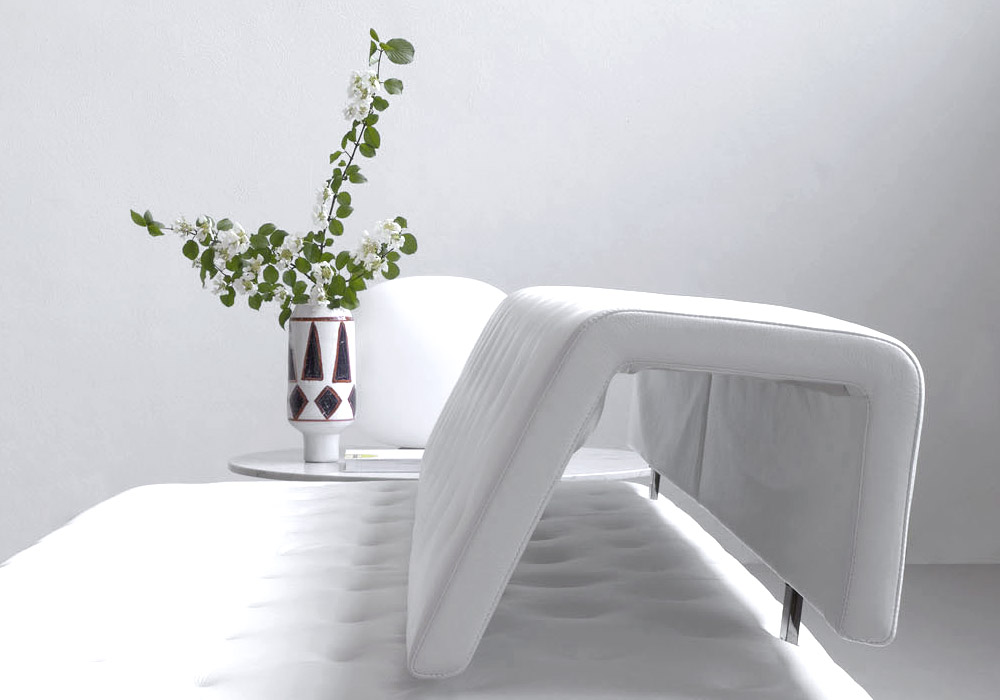
- �̹����� ��� ����.
- �ؽ�Ʈ�� ��� ����.
- �̹��� + �ؽ�Ʈ ��� ����
...
...
- �����մϴ�.
�Ǽ���ȭ�� �����ϴ� ������ ����
������ ���� ������ ����
�ΰ��� �ڿ��� �����ϴ� ģȯ�� �Ǽ�

�츮������ ���� ��ȭ�� �̲��� �� (��)����ȸ��� ��ȸ�ǻ��, �ø����ְ���� �� �ô뺰 ��ǥ ��¡���� â���� �Խ��ϴ�.������ �Ǽ� ���� ���۷μ� �Ǽ���ȭ�� �����ϴ� ������ �����մϴ�.

���� ������ ����Ʈ �귣�� ��e���Ѽ����� �ְŹ�ȭ�� ���ο� ���� ����Խ��ϴ�. �ܼ��� �ְ� ������ �ƴ� ȯ��, ����, �ǰ�, ��ȸ, ��ȭ, ���� �� ���� ��� �κ��� �����Ͽ� ����� ���Ϻ��� ���� ������ �����մϴ�.

��ȸ�����ں� �Ǽ��� ������ �츮���� ������ �ٽ� ���� (��)����ȸ��� ���� �ְ� ������ ������ ���Ͽ츦 �����ϰ� ������, �� ����� ��������� �ΰ��� �ڿ��� �����ϴ� ģȯ�� �Ǽ��� ���� ���ϴ�.
�̰��� ����ȯ�� �������Ϳ����� �ְ�ȯ�濡������ ���ȯ�� �� ������ �о��� ������ ������ ���� ��� ������� ���̰� �ֽ��ϴ�. �̷��� �ְ��� ������� �������� ���� ���� ��� ��ǰ�� �����Ͽ� ����� ��ġ�� ���� �Ǽ� ����� ������ �����ϰ� �ֽ��ϴ�.
���� ���ʷ� ���� ���� ������ �ڸ�ȭ�� ��ǥ�� �Ǹ��� ����ȯ�� �������� ECO House������ ���� 3L house�� ����¿� �¾翭, ����, dz�� �� �� ��� ������ ����� �����Ͽ� �� �������� ������ �پ�Ѿ� ���� �������� �ְŰ����� ����� ���� ���ݵ� ���� ���� ������ ������ �ŵ��ϰ� �ֽ��ϴ�.
| �Ը� | ���� 3��, ���� 1�� |
|---|---|
| ������ | 970�� |
| �ü� | �⵿�� ����Ʈ 3����, ���ı��� 4���� |
| ������ | �¾翭, �¾籤, �����ó���, dz�¹���, ��������,
���ߴ�Ʈ, �ڿ�ä��, ���(���)Ȱ��, ���˸� ����Ʈ ���帶�� |
| ü��ü� | �ٴ��������, �ڿ�ä����, �������ɽ�, ������,
��ȯ��� |
������߿��� ȯ�������� �پ��� ���� ���� ���(TOC, GC, UV, HPLC ��) �� �� �м� ���(FT-IR ��) �����Ͽ�, �ϼ�ó��/���� ó��/�ؼ����ȭ �о� �� �پ��� �� ���� ��� ������ ���� �ϸ�, ȯ�� ���忡�� ���Ǵ� ������ �����Ͽ� ������� �ذ� ����� �����ϴ� ������ ���� �ǰ� �ֽ��ϴ�.
������߿��� �ϼ��о߿��� ���� ���ʷ� ���н� ������ ����� �̿��� MBR(Membrane Bio Reactor) ���� e-Tris II �� �����о߿��� ���� ������ 30% �̻� ����� �� ������ �Ǽ��� �� ��� ���� 10%�̻� ������ �� �ִ� ���� Dual Membrane Filtration System �ű���� �Ρ������� ȹ�� �ϴ� �� ��ȿ�� ģȯ�� ����� ���� �ϰ� �ֽ��ϴ�.
| �Ը� | 2�� ���赿 (�뵵 : ���ϼ��� �� �������) |
|---|---|
| ������ | 1,039.17�� |
| �������� | �ϼ� ó�� ���� ����, ���� ó�� ���� ����, �ؼ����ȭ ���� ���� �� |
| ������ |
������ ������ �ϼ� ����ó�� SBR ����(e-Tris I)
������ ���� �������� ������ ����ó��MBR ����(e-Tris II) 2�� ������ ����ó�� ������ ����� ���հ����ý��� |
����ȯ�濬������ �湮�Ͻô� �е鲲 ������߿��� ������� �Ұ��ϰ� ȫ���ϴ� �������μ� ���� 30�ֳ��� ����Ͽ� 2010� �Ǹ��Ǿ����ϴ�.
����ȯ�濬������ ���� ���� �� 20���а� ������߿��� ������ �� �ֿ����, �������� ���� �����Ͻ� �� �ֽ��ϴ�.
1939�� ���������� ���縦 �״�� ȫ������ ��ҽ��ϴ�. ������ ���� �̾����� ���� �� ������ ������ ���� ������ �Ѵ��� �� �� �ֽ��ϴ�. �� �оߺ� �������� �� �����ǰ ���� ���������� ��� (��)����ȸ�� ������߿��� �پ ������ ���� ���� �� �ֵ��� �Ͽ����ϴ�. ���� ���ʷ� �����Ǿ� ������ ���縦 �ڶ��ϴ� ������߿��� ������ ȫ�������� ü���Ͻñ� �ٶ��ϴ�.
����ȯ�濬������ ���� ���� �� 20���а� ������߿��� ������ �� �ֿ����, �������� ���� �����Ͻ� �� �ֽ��ϴ�.
1939�� ���������� ���縦 �״�� ȫ������ ��ҽ��ϴ�. ������ ���� �̾����� ���� �� ������ ������ ���� ������ �Ѵ��� �� �� �ֽ��ϴ�.
�� �оߺ� �������� �� �����ǰ ���� ���������� ��� (��)����ȸ�� ������߿��� �پ ������ ���� ���� �� �ֵ��� �Ͽ����ϴ�. ���� ���ʷ� �����Ǿ� ������ ���縦 �ڶ��ϴ� ������߿��� ������ ȫ�������� ü���Ͻñ� �ٶ��ϴ�.
����ȯ�濬������ ���� ���� �� 20���а� ������߿��� ������ �� �ֿ����, �������� ���� �����Ͻ� �� �ֽ��ϴ�.
1939�� ���������� ���縦 �״�� ȫ������ ��ҽ��ϴ�. ������ ���� �̾����� ���� �� ������ ������ ���� ������ �Ѵ��� �� �� �ֽ��ϴ�. �� �оߺ� �������� �� �����ǰ ���� ���������� ��� (��)����ȸ�� ������߿��� �پ ������ ���� ���� �� �ֵ��� �Ͽ����ϴ�. ���� ���ʷ� �����Ǿ� ������ ���縦 �ڶ��ϴ� ������߿��� ������ ȫ�������� ü���Ͻñ� �ٶ��ϴ�.
����ȯ�濬������ ���� ���� �� 20���а� ������߿��� ������ �� �ֿ����, �������� ���� �����Ͻ� �� �ֽ��ϴ�.
1939�� ���������� ���縦 �״�� ȫ������ ��ҽ��ϴ�. ������ ���� �̾����� ���� �� ������ ������ ���� ������ �Ѵ��� �� �� �ֽ��ϴ�. �� �оߺ� �������� �� �����ǰ ���� ���������� ��� (��)����ȸ�� ������߿��� �پ ������ ���� ���� �� �ֵ��� �Ͽ����ϴ�. ���� ���ʷ� �����Ǿ� ������ ���縦 �ڶ��ϴ� ������߿��� ������ ȫ�������� ü���Ͻñ� �ٶ��ϴ�.
We have created a awesome theme Far far away, behind the word mountains, far from the countries Vokalia and Consonantia, there live the blind texts.Far far away, behind the word mountains,
Man must explore, and this is exploration at its greatest. Problems look mighty small from 150 miles up. I believe every human has a finite number of heartbeats. I don't intend to waste any of mine.
Science has not yet mastered prophecy. Failure is not an option We predict too much for the next year and yet far too little for the next ten.


�������� �����ŷ��� ���� ���� Ȩ���������� ������ ���ž���(����ũ��) ���� �̿� �Ͻ� �� �ֽ��ϴ�.