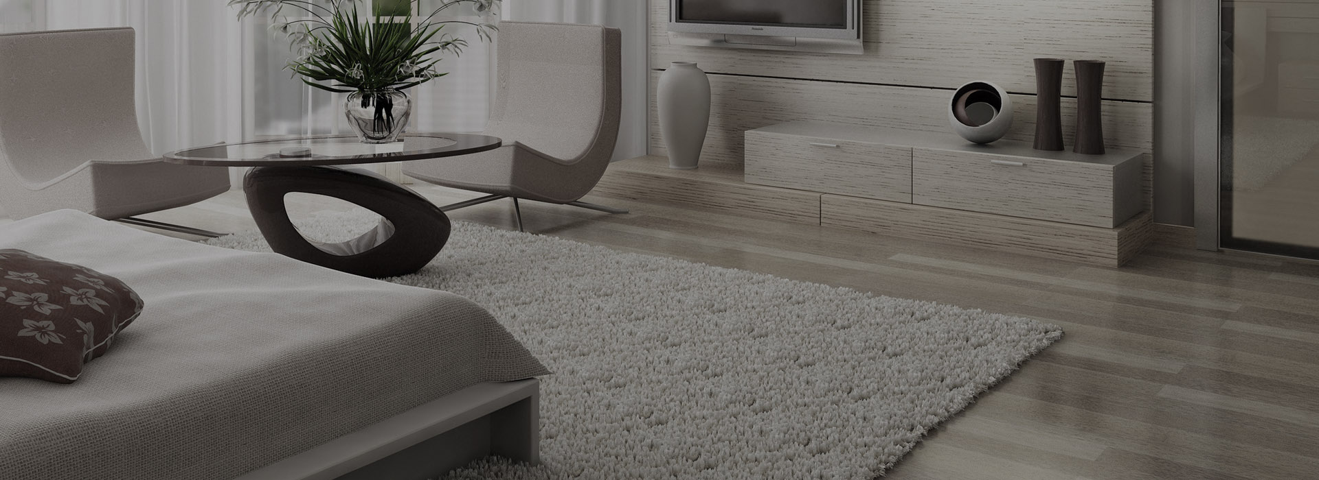
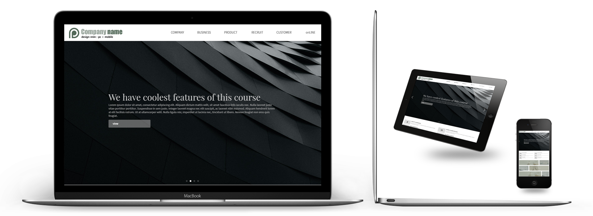
MULTI-REACTING TO OPEN UP NEW SPACE
What is a responsive web? This means that the size of the web page is automatically readjusted depending on the device type such as smartphone, tablet, and pc.
It is a web technology that changes the size according to the environment to make it easy for users to view.
It provides users with an optimized environment for specific devices of various devices by creating (modifying) one HTML source.
Click more
VARIETY OF LAYOUT MODULES FOR NOVICE USERS
Module design can only be made by pre-calculating various possibilities.
Like the story of the ending structure, the imagination of the designer and the imagination of the user are encountered through the form of module.
In the module design, the original functions are designed from the beginning.
Each module is standardized and designed from the beginning as a module, so it can fit any combination.
The important point here is that each module must be harmonized with each other.
Click more
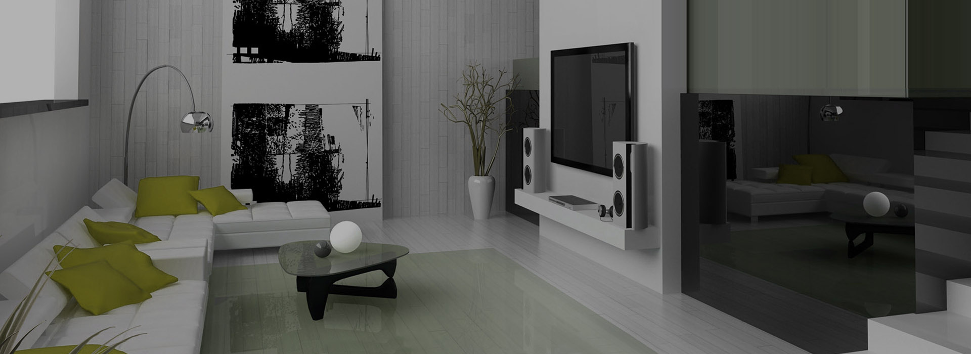
CHOOSING TO INCREASE THE VALUE OF YOUR HOMEPAGE
Multi-responsive homepages for all devices with one production cost are the best choice to increase your value.
There is no need to create a separate mobile homepage for each device.
Click more
Multi-reacting to open up new space
What is a responsive web? This means that the size of the web page is automatically readjusted depending on the device type such as smartphone, tablet, and pc.
It is a web technology that changes the size according to the environment to make it easy for users to view.
It provides users with an optimized environment for specific devices of various devices by creating (modifying) one HTML source.
Click more
Choosing to increase the value of your homepage
Multi-responsive homepages for all devices with one production cost are the best choice to increase your value.
There is no need to create a separate mobile homepage for each device.
Click more
Previous
Next
C/S CENTER : 고객만족센터
온라인문의
-
T. 1688 - 1688 / F. 02.3032.3203
-
- 월 ~ 금 : AM 10 : 00 ~ PM 06 : 00
- 토, 일, 공휴일은 휴무 입니다.
- email : company @ naver.com
- 업무 시간 외에는 게시판으로 문의 바랍니다.
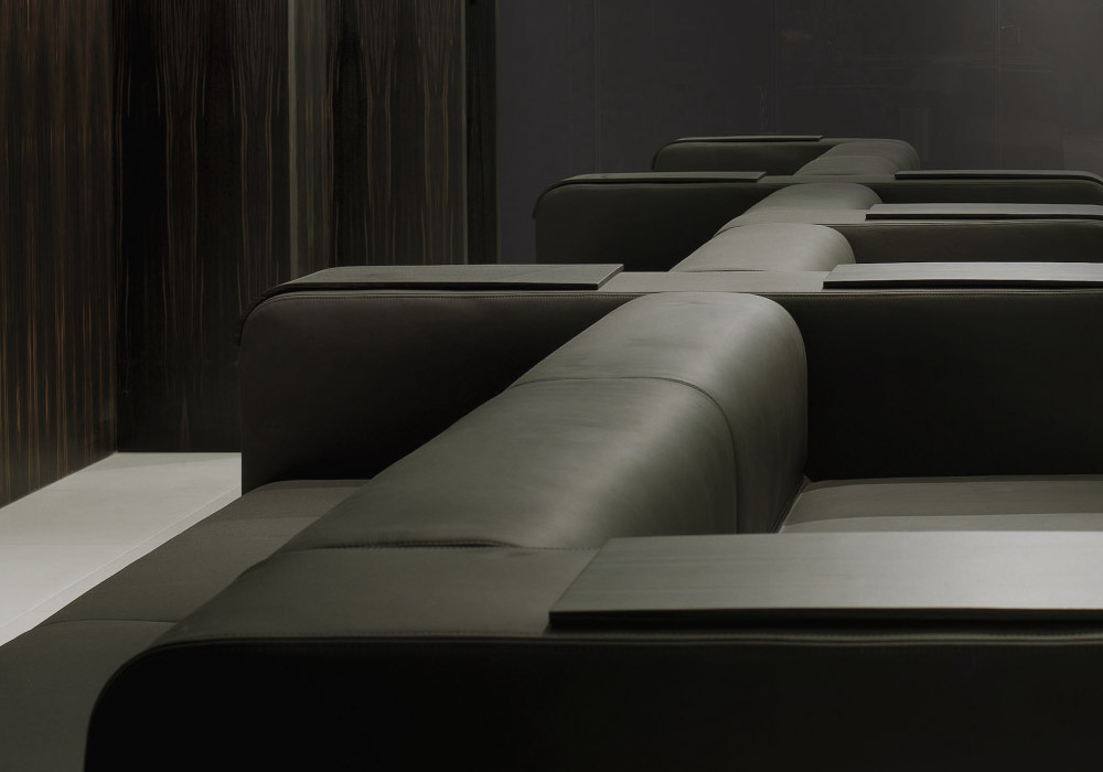
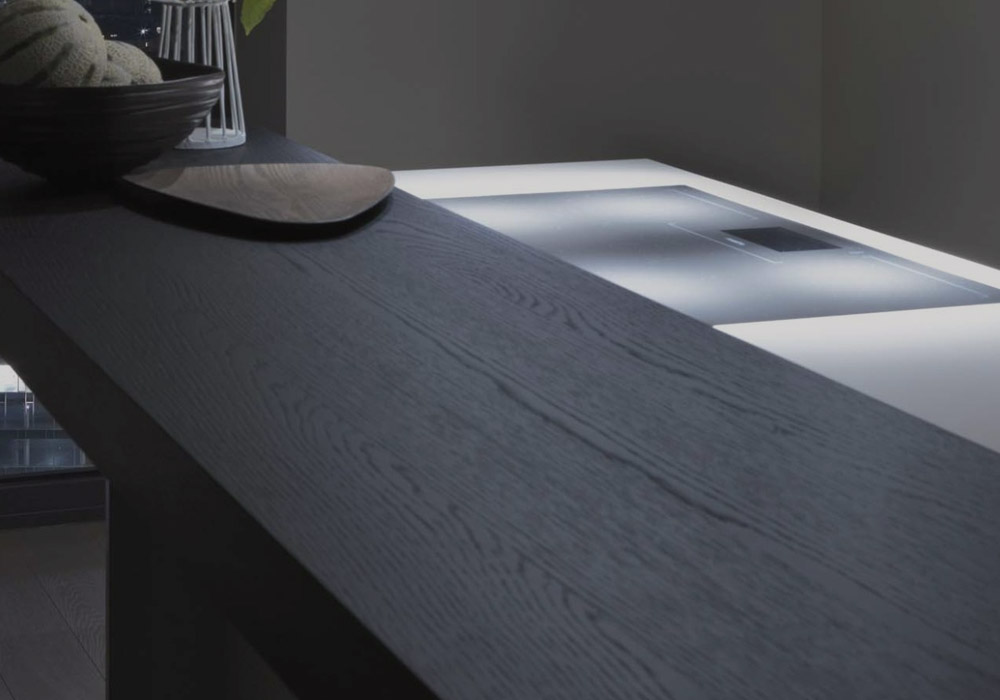
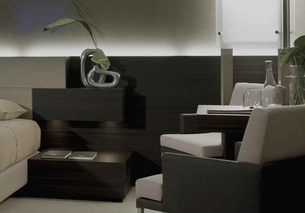
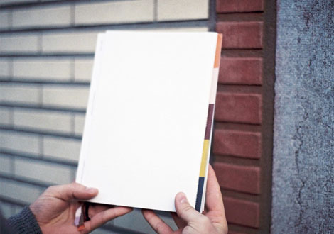
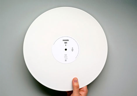
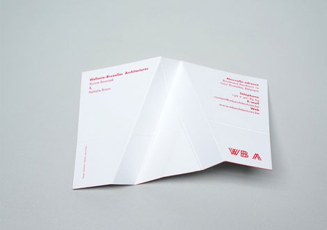
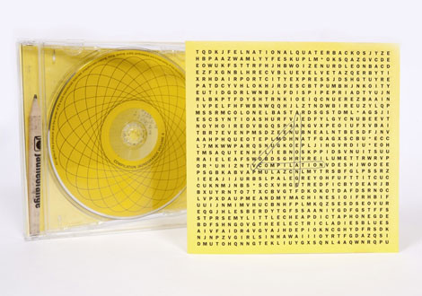
PRODUCT GALLERY Ⅲ
We're a close team of creatives, designers & developers who work together to create beautiful, engaging digital experiences. We take pride in delivering only the best.
홈페이지의 가치를 올려주는 멀티반응형
모바일용 홈페이지를 별도로 제작할 필요 없으며, 한번의 제작 비용으로 각각의 디바이스에 대응하는 멀티반응형 홈페이지는 효율을 높여주는 최선의 선택입니다.
IDENTITY & BRANDING
A beautiful product needs to be complemented with a great branding. Our design team will help you create it
Join Now
USER EXPERIENCE
At the heart of everything we do lies a great user experience. We take pride in our interfaces and really think and test them through
Join Now
PHOTOGRAPHY
A beautiful product needs to be complemented with a great branding. Our design team will help you create it
Join Now
MOBILE & WEB DESIGN
We design beautiful responsive websites and iOS apps focusing on design, content and a great user experience.
Join Now
IOS DEVELOPMENT
We're awesome at coding iPhone and iPad apps. We'll help you from idea to the finish application.
Join Now
VIDEO PRODUCTION
A beautiful product needs to be complemented with a great branding. Our design team will help you create it
Join Now
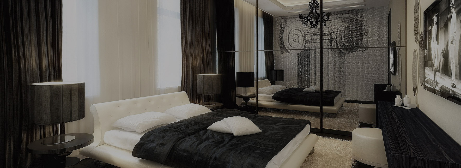
Far far away, behind the word mountains
Architecture is a visual art, and the buildings speak for themselves. We shape our buildings; thereafter they shape Us. far from the countries Vokalia and Consonantia, there live the blind texts.
Click View